


Additionally, the importance of consistency should not be underestimated. Consistency comes back in many forms, be it visual or functional consistency, tone of voice or UI patterns. Consistency is also probably the hardest element of invisible design to truly master. Nobody is perfect when it comes to design consistency, but it’s important to strive for it.

CREATIVEDESIGN
06/03/2019 • Yildiray Günay
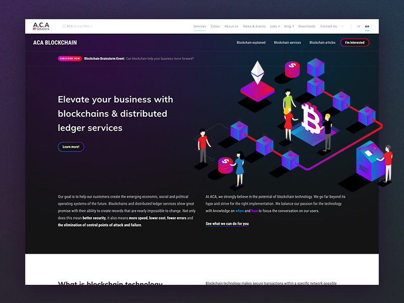
Monthly Design Review #4 – What is Invisible Design?
Invisible design is simple and elegant and does not attract attention to itself, it allows users to achieve their goals fast with minimal effort, maximum efficiency. In short, invisible design creates user experiences that are so natural, they feel ‘invisible’: not artificially designed.
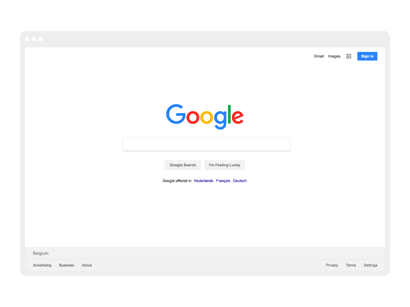
The best recognizable example of invisible design is probably the Google search homepage. There are no visual distractions and the page is straight to the point. The greatest invisible design detail would be the autofocus on the search bar on page load, which increases its usability.
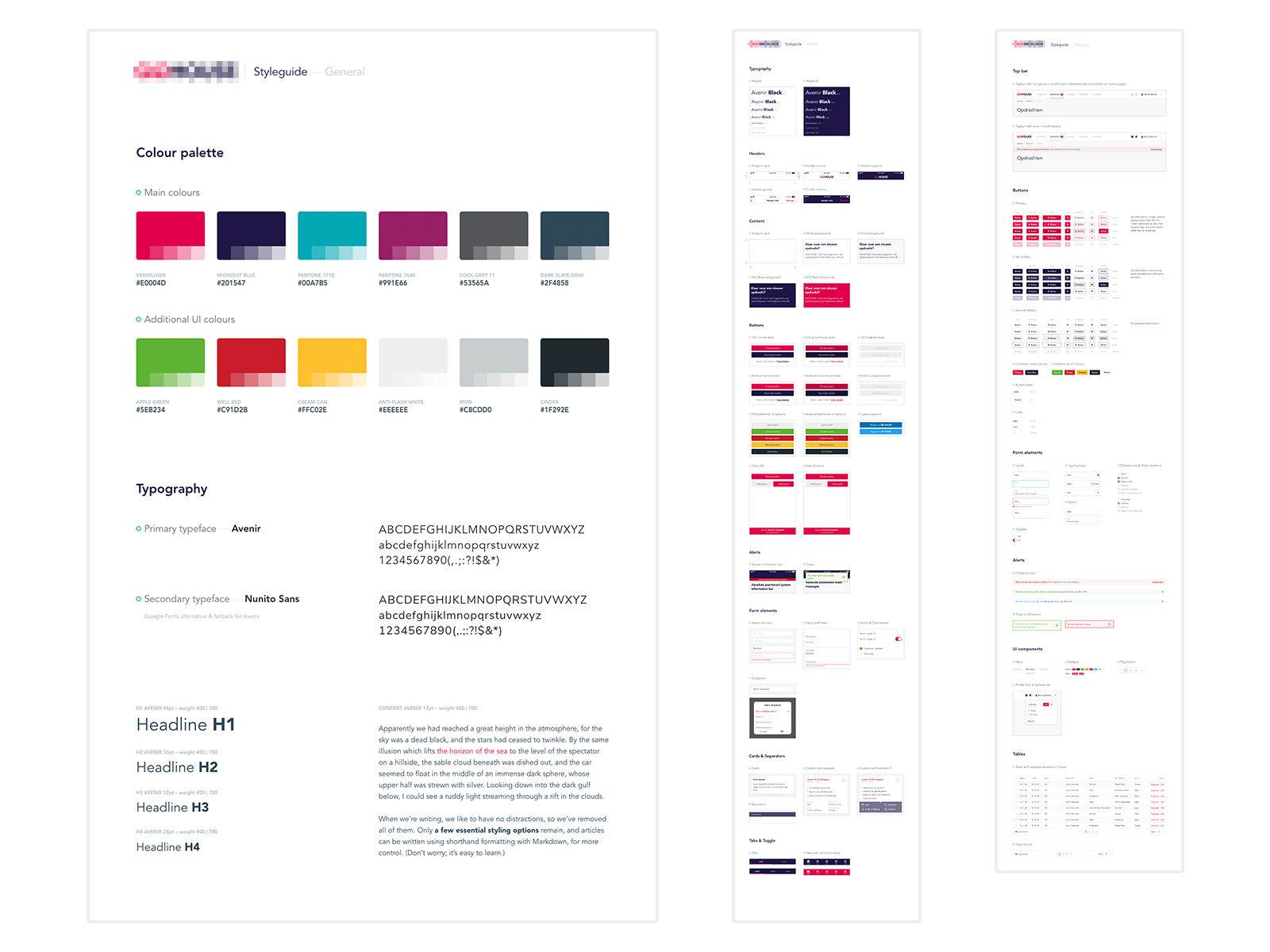
The best design decisions are the ones you don’t even notice. In order to create invisible design, you have to flawlessly integrate the foundations, i.e. typography, colours, buttons, components, space, grid, size and positioning. These elements need to be defined in one central place and then used across the product you’re designing.
One way we maintain this at ACA is to create an UX / UI Design language through a component style guide and follow it strictly in our projects. You can learn more about what a component style guide is and why it’s so important to have one in one of our previous blog posts.
Good design, when it’s done well, becomes invisible. It’s only when it’s done poorly that we notice it.
— Jared Pool, Writer, researcher, speaker, educator, and an expert on the subjects of usability, software, design, and research. at Jared Pool
How can I achieve invisible design?
So, invisible design is good design. But how do you actually achieve invisible design? We’ve compiled a few tips below that may help you.
 Visual consistency
The human eye tends to build a relationship between similar elements within a design. You can achieve similarity using basic elements such as typography, shapes, colors, spacing and size.

A component style guide is the best way to bring visual consistency to your product. This should include all the important guidelines for your product’s identity and voice. Elements that are perceived the same way make up the visual consistency. This lowers the learning curve, for example for new screens that use the same visual elements.
 Functional consistency
The principle of functional consistency is very similar to visual consistency. If your product’s functionality is consistent, it becomes more usable and easier to learn for users when similar actions, forms and elements work and/or behave in the same way.

Having similar patterns that behave the same way increases the predictability of the design, and predictability leads to users feeling safe and secure.
 Less is more!
Simplify your user flows by limiting your steps to the minimum to avoid confusion. Don’t let your users notice what they are doing, let them think as little as possible through simple and clear steps.
When an action that takes four steps can easily be completed in two, you should always choose to perform tasks with the minimum number of easy-to-do actions.
 Tone of voice
Tone of voice isn’t what you say, but how you say it. It’s the way you construct sentences, the language you use, the sound of your words and the personality you communicate.
The use of one fixed tone in texts and other forms of communication makes the design consistent and recognizable. It also gives you a way to build up trust with your users, since they know what they can expect from you.
 Visual flow
Visual flow is about movement and direction, and leading the eye from one part of a composition to another in the direction you want it to move. You can create flow through a combination of visual weight and visual direction.
Add elements that serve as barriers to change the direction the eye is moving. Create open paths in empty space to allow easy movement through and between your positive design elements. This will bring balance and harmony in your design.
Below are a few examples. You can click the thumbnails to navigate to the actual webpage and look at it in more detail.
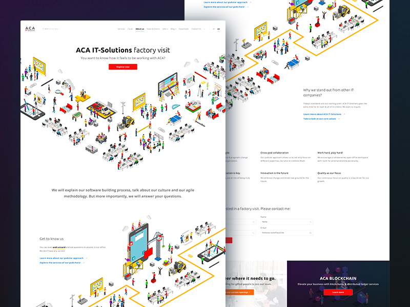
With the motion in the illustrations (arrow pointing downwards and diagonal illustration) you can guide your users through the page.
The visible (white) block & text within a viewport suggests that the user can scroll down for more content.
Background illustration (left bottom corner) and an open empty path between sections suggest that there is more content below what is currently visible.
 UI Patterns
Human beings look for patterns wherever they go, even on the web. We seek relationships among the things we see, and latch onto patterns that validate those relationships. So why reinvent the wheel when it comes to the way people navigate a site, an app or a form? Use patterns that users are wired to use. After all, we’ve been using the web for quite some time and there are already usable, time-tested solutions.
User interface (UI) patterns are reusable solutions to common usability problems. When users see the same solution implemented in different products such solutions became not just familiar to them, they become expected.
 Testing
Testing offers a chance to gather user feedback early in the process and shape your design decisions with evidence before committing to building anything.
With a clickable prototype, you can observe user interaction with the design. Establish a clear purpose for your prototype and follow your pre-determined set of requirements. You can study user behavior early on in the development process and make adjustments to your design to improve the user’s experience.
There are various tools that we use within our teams. These are the main ones: Adobe XD, Marvel, and Invision.
A word about consistency
As you may have noticed already, consistency is a key design principle for invisible design. Consistency eliminates confusion! If users have to find a new way each time to resolve a similar kind of problem while working in a design, they will get confused and frustrated at the same time. A usable and user-friendly design always provides a consistent experience.
Consistency is one of the most powerful usability principles: when things always behave the same, users don’t have to worry about what will happen.
— Jakob Nielsen, Web usability consultant with a Ph.D. in human–computer interaction. at Jakob Nielsen