Design a better layout by designing CRAP
Robin Williams – no, not that one – is one of the most interesting authors about text and layout design. Her book, The Non-Designer’s Design Book: Design and Typographic Principles for the Visual Novice, is a true gem. In the book, she explains the 4 basic rules for effective graphical design: contrast, repetition, alignment and proximity (CRAP).
In this blog post, we’ll go over those 4 basic rules and how you can easily implement them in your layout design. I’ve already taught you how to write scannable web content, but that blog post didn’t cover the layout of texts all that much. So let’s set the record straight! While scannability in a text itself is key, it is also closely tied with the layout of the text. After all, a text that’s a joy for the eye is a text that is inviting to be read!
1. Contrast
Let’s start with the first rule for effective layout design: contrast. If elements on your page (such as type, color, size, shape and so on) aren’t identical, let them differ extremely from each other. Don’t be a wimp. Let contrast shine! A good example is the size of the letters in a newspaper headline versus the ones in the article itself. In contrast (see what I did there?), a headline typed in Constantia 11 above an article in Constantia 10 doesn’t show enough difference between the two, making it difficult to differentiate.
So how do you add contrast to your page? Contrast can be created in many ways. You can contrast
- large type with small type,
- a graceful oldstyle font with a bold sans serif font,
- a thin line with a thick line,
- a cool color with a warm color,
- a smooth texture with a rough texture,
- a horizontal element (such as a long line of text) with a vertical element (such as a tall, narrow column of text),
- widely spaced lines with closely packed lines,
- or a small graphic with a large graphic.
Again, don’t be a wimp. You cannot contrast 12-point type with 14-point type, you cannot contrast a half-point rule with a one-point rule and you cannot contrast dark brown with black. Get serious! Contrast is crucial to the organization of information (its scannability): a reader should always be able to glance at a document and instantly understand what’s going on.
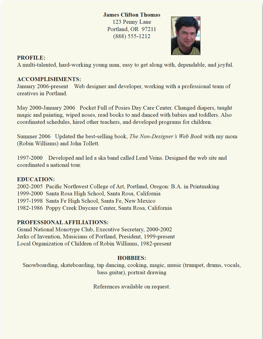
The information in this resume is all there, but it doesn’t look inviting to read and it doesn’t grab your attention.
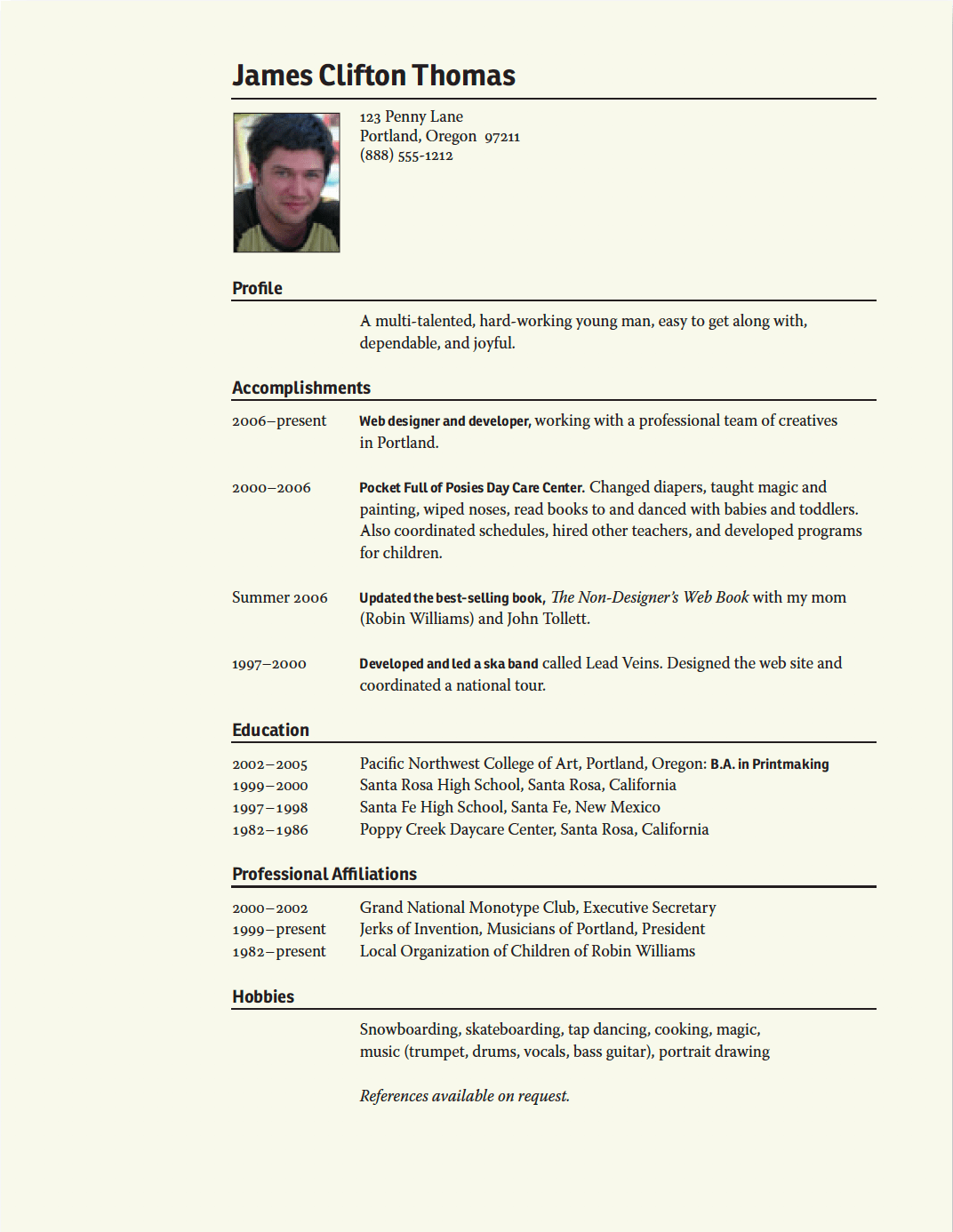
In this example’s layout, there is a lot more contrast, which improves its scannability enormously.
2. Repetition
The second rule of effective layout design is the rule of repetition. It states that you should repeat some aspect of the design throughout the entire piece. Repeating visual elements in your brochure, newsletter or blog post helps to develop a structure and strengthens the feeling of a unified piece of content. The repetitive element may be a bold font, a thick rule (line), a certain bullet, design element, color, format, spatial relationships, etc. It can be anything that a reader will visually recognize. You can think of the rule of repetition as a reminder to stay consistent.
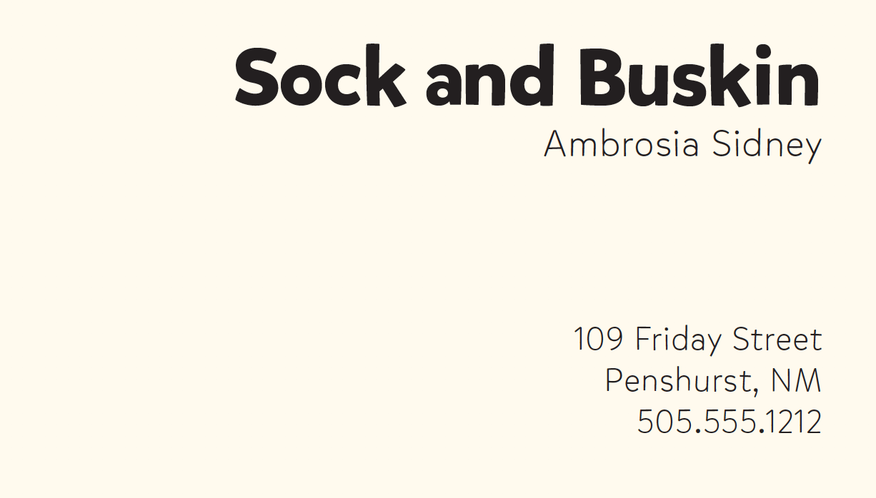
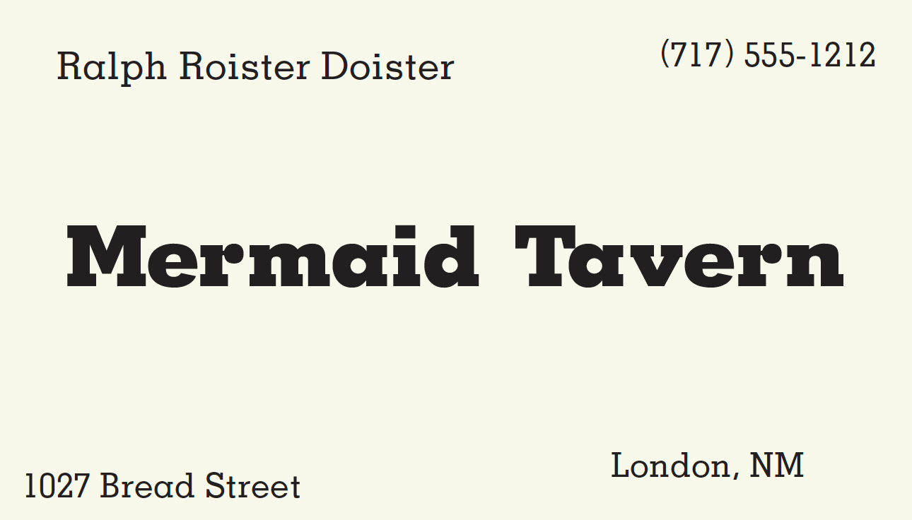
When you get to the end of the information on this card, your eye just kind of wanders off.
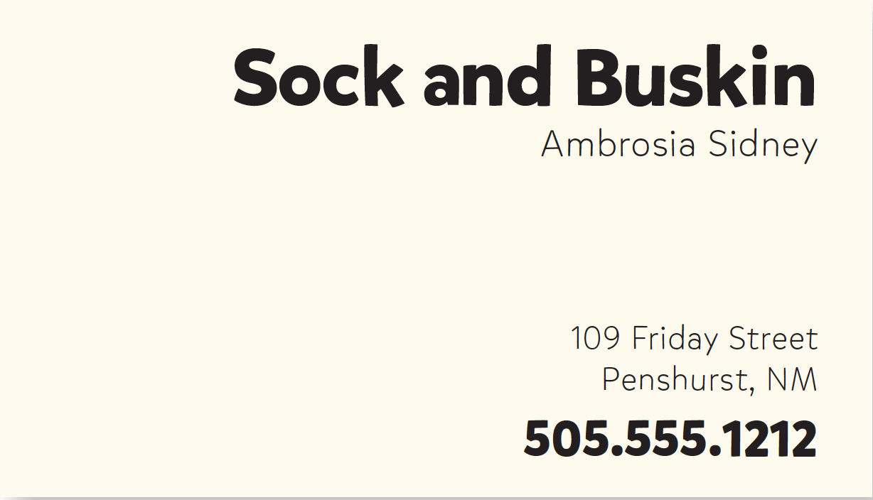
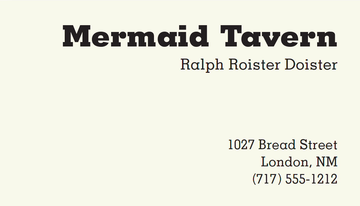
Now when you get to the end of the card, your eye bounces back and forth between the bold type elements. That’s the point of repetition — it ties a piece together and provides unity.
Het It’s like accenting your clothes: if you wear a black outfit, you might accent it with jewellery and shoes in the same shade of red. However, be careful to not repeat an element so often that it becomes annoying or overwhelming. Think of rule #1 and be conscious of the value of contrast! For instance, if you wear the same black outfit, but now with a red hat, red earrings, a red scarf, red shoes, and a red coat, the repetition would not be a stunning and unifying contrast: it would be overwhelming and the focus would be confused.
3. Alignment

Nothing is ever allowed to ‘just end up’ on your pages, no matter the medium you’re writing for. Every element should have a visual connection with another element on the page. This way, you create a fresh and clear look and feel.
When items are aligned on the page, the result is a stronger cohesive unit. Even when aligned elements are physically separated from each other, there is an invisible line that connects them, both in your eye and in your mind. Although you might have separated certain elements to indicate their relationships (using the rule of proximity), the rule of alignment is what tells the reader that even though these items are not close, they belong to the same piece.
The elements on this card look like they were just thrown on and stuck. None of the elements have any connection with another element on the card. Some items are left-aligned, some are right-aligned and others are centered.
By moving all the items on the card over to the right and giving them one alignment, the information is instantly more organized (also because they’re grouped together). The text items now have a common boundary which connects them together.
Avoid using more than one text alignment on the page. For example, don’t center some text and right-align other text.
4. Proximity
Items on your page that belong together or have a connection in one way or another, should always be close to each other. Remember: proximity implies a relationship. That applies to people in relationships, for words in a sentence and for headlines and bodies in a text. That also means that items or groups of information that are not related to each other should not be in close proximity to other items. This gives your readers an instant visual clue to the organization and content of your page.
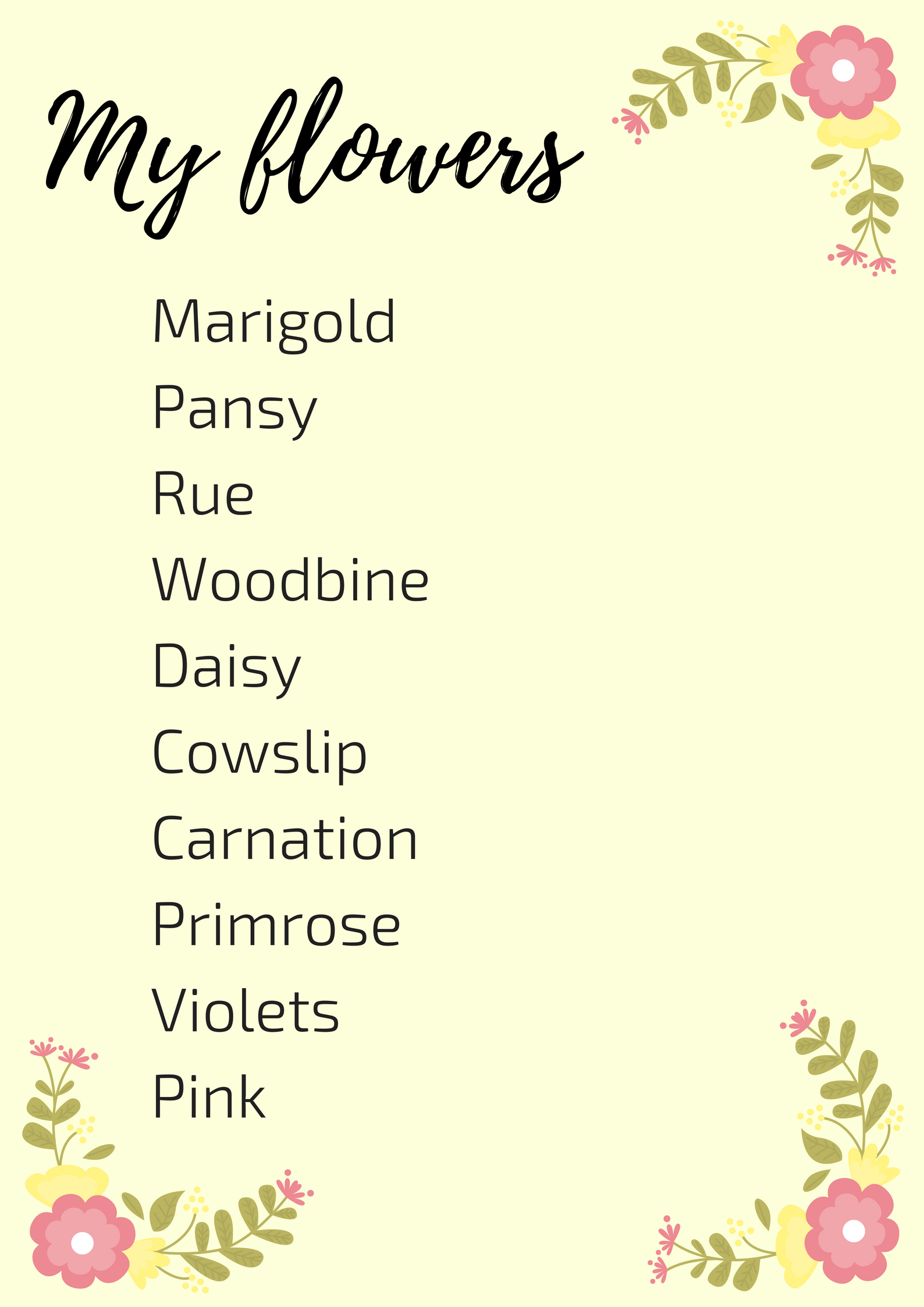
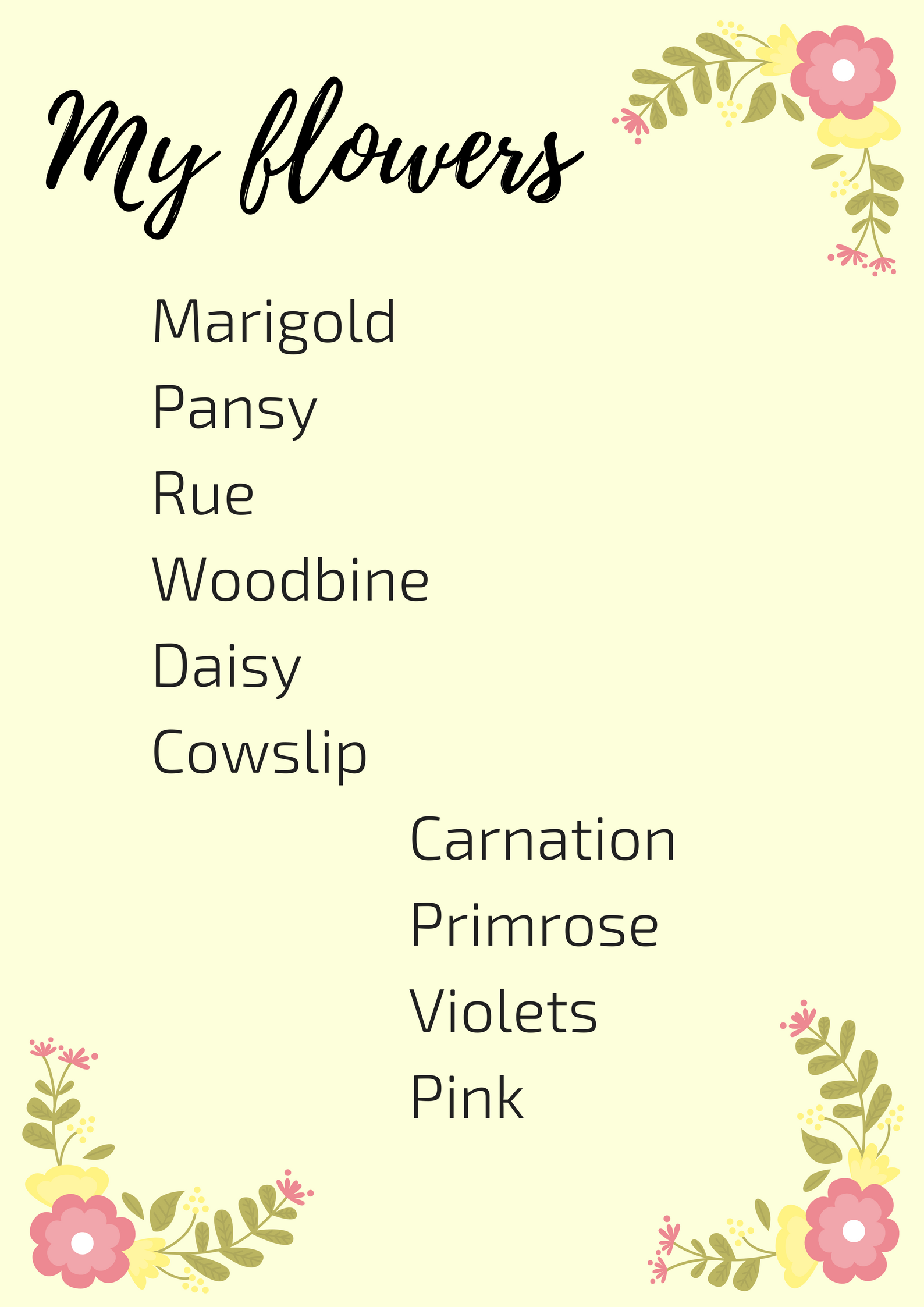
Let’s take a simple example to illustrate the rule of proximity. I’ve put 2 lists below, both containing the same information. What do you assume about the flowers on the first list? Probably nothing much, right? What about the flowers on the second list? It appears that the last four flowers are somehow different from the others. You understand this instantly. And you understand it without even being conscious of it. You know the last four flowers are somehow different because they are physically separated from the rest of the list.
🚀 Takeaway
Rarely is only one rule the only answer to a page. The other three rules are intrinsic to the design process and you will usually find yourself using all four. But take them one at a time. It’s a good idea to start with proximity first and then go from there.
Contrast: If elements on your page (such as type, color, size, shape and so on) aren’t identical, let them differ extremely from each other.
Repetition: repeat some aspect of the design throughout the entire piece, such as bold font, a thick rule (line), a certain bullet, design element, color, format or spatial relationships.
Alignment: every element should have a visual connection with another element on the page.
Proximity: items on your page that belong together or have a connection in one way or another, should always be close to each other.
I hope these 4 rules serve you as well as they do me. Apply them to your layout design and watch how it improves them!
💩


Stijn is the ACA Group's resident copywriter and content marketer. He's interested in writing (obviously), content marketing, web content, graphic design, UX and UI and likes to challenge himself with new insights.