3 tips om jouw handout designs te moderniseren
Laten we deze blogpost beginnen met een paar gênante herinneringen uit het verleden. Weet je nog dat je jouw juf op de kleuterschool 'mama' noemde? Of die enorme puist op je voorhoofd op de eerste dag van de middelbare school? Laten we eens kijken naar een foto van een paar jaar geleden. Die kleren... die afgrijselijke kleren. Hoe kun je gedacht hebben dat je altijd die super strakke broek zou blijven dragen? Nou... jij bent veranderd en dat geldt ook voor de modetrends. Trends blijken ook snel te veranderen in andere design-sectoren. In deze blogpost bespreek ik 3 tips om het ontwerp van jouw hand-outs te moderniseren en verbeteren we een oud printontwerp zodanig dat het past bij deze tijd. Ik gebruik als voorbeeld een recent herontwerp van een hand-out voor ons mobiele team.
1. Go digital
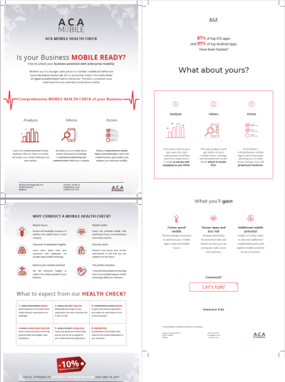
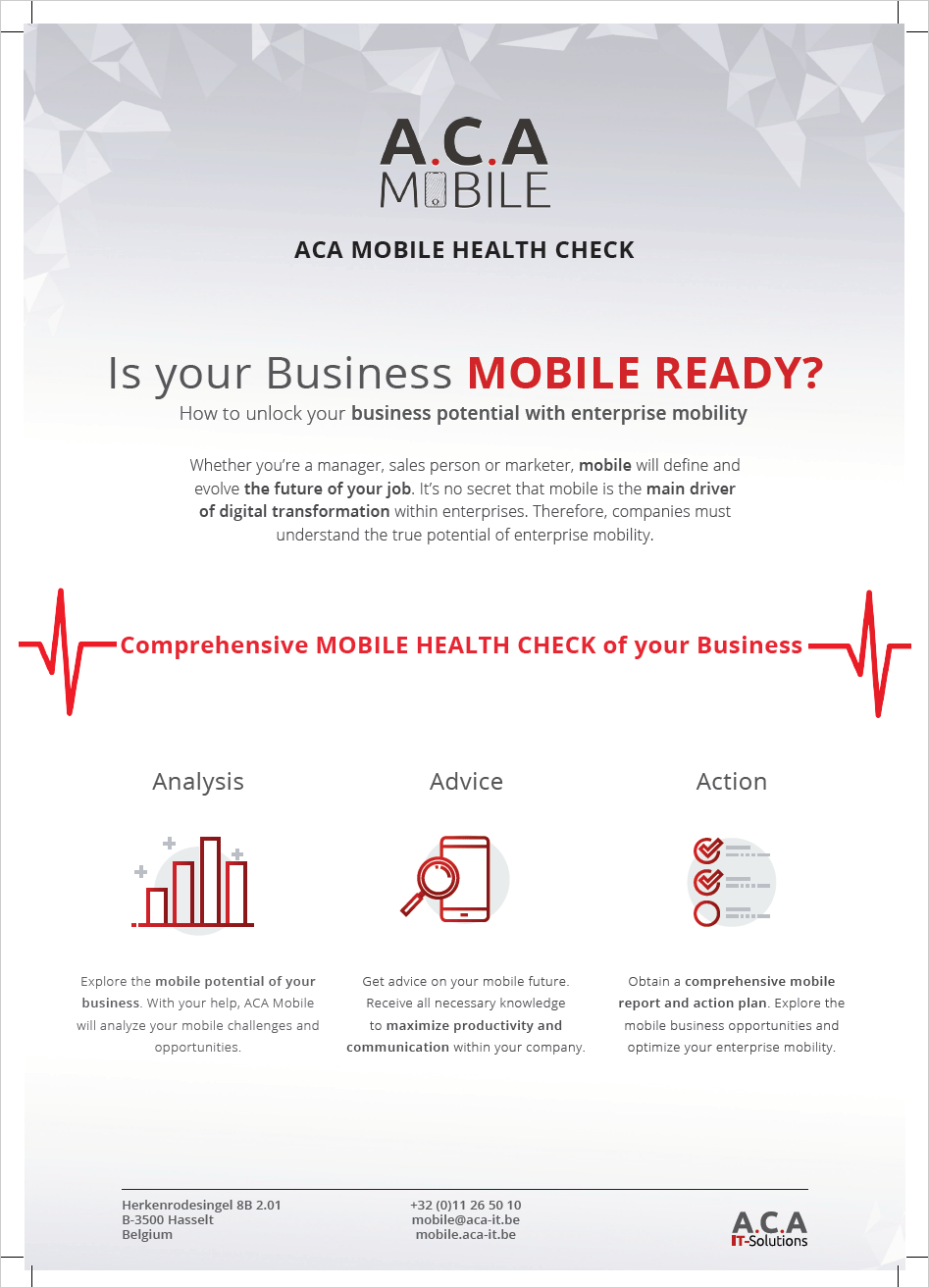
The biggest change in this redesign is that we’re actually stepping away from print and moving towards digital media, such as a PDF file. A couple of advantages go hand in hand here. You no longer have to worry about how you’re going to jam all your information on two A4 pages, since you aren’t limited to a certain page size. This gives you more freedom with both your structure and information placement. As you can see in our example (click the picture on the right), this results in a lighter design that’s much more enjoyable to read because of extra whitespace between sections.
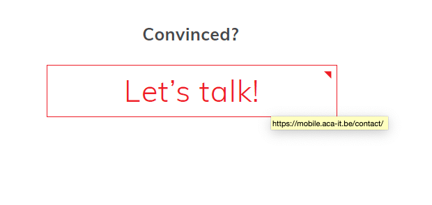
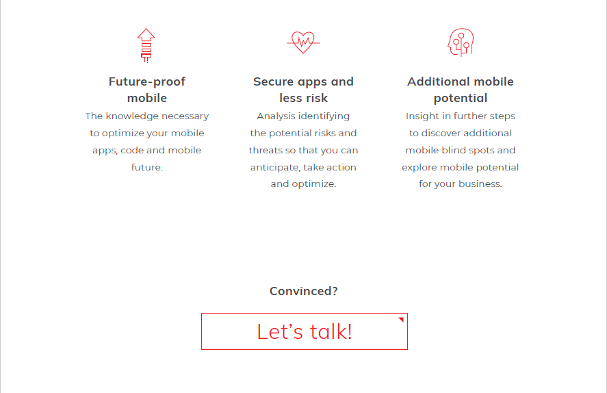
Another big improvement is the ability to make use of links. You don’t have to write a full URL anymore, because you can just click on a shorter one or even add a button like you’re designing a webpage. Try adding links to logos or pictures. By doing this, you’re changing a completely static object into a link to even more information. Your handout is no longer limited to just the information on your two pages. Be careful you don’t forget to add links to anything that seems ‘clickable’ though. If your user tries to click on something that should’ve been a redirect to for example your website and it doesn’t work, you don’t make a good impression.
2. Add more whitespace!
First things first, whitespace doesn’t need to be ‘white’ space. Whitespace refers to empty breathing room in your design, not a white colour between design elements. Imagine getting a page to read and everything is cropped in the first half of the page. I’d rather gouge my eyes out than try to read that. Space out your information and use that empty space to improve the reader’s experience and even guide them to parts you want them to read. In other words, empty space makes your content more readable. When your focus is to inform your reader, readability is top priority.
In our old design, we used an abstract background. Pictures or patterns can be used as whitespace but aren’t ideal if you’re going for a professional and clean look. We simply changed to a white background instead. This way, we structured our design in a couple of ‘information containers’. The whitespace makes sure each of those containers gets the focus it deserves. So don’t just read whitespace and see it as unused space. Think of whitespace as a guide for your reader.

3. Don't overdo it
You want to tell your audience something, so get to the point. Don’t try to over-explain and don’t use words you even barely know to sound smart. The same goes for showing pictures and using design elements. Nobody wants to scroll through 10 pictures which all show the same thing to find information they need. Say what you need to say and show what you need to show.
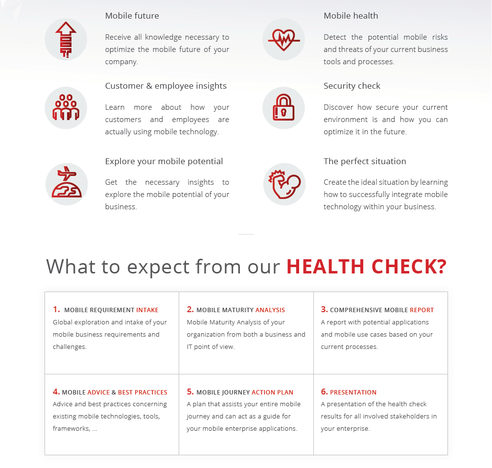
Also, try using a number instead of an icon when speaking about a certain percentage for example. People love numbers (just look at all those infographics floating around on the internet as proof). Try to have a nice balance between icons and percentages when designing something. Of course, there’s nothing wrong with using icons as a visual too. They can break your wall of text, make it more enjoyable to reed and keep the reader interested.
Last but not least, your design isn’t a child’s coloring book. Don’t use all of the crayons available! We went way overboard in our previous design. Now we’re only using red as our main color because it’s also the main color of ACA’s corporate identity. If you really want to use more color in your new design, be consistent. Don’t give your first title a blue color while giving your other titles a purple color. It’s pretty basic really, but often overlooked.
🚀 Takeaway
Print design isn’t exclusively for just print anymore in today’s digital world. If you want to update your previous print designs so they fit in our online lives as well, here are some things you should take into account:
- Forget strict page size limits.
- Include clickable links in your design. You can even add buttons like on a website.
- Use as much whitespace as you need to help your reader ‘breathe’ for a second and rest their eyes.
- Be brief!
- Include visuals, but stay consistent in your color palette.